We have completed the chapter on "line", and are currently working on projects for "contrast". The chapter is mostly about contrast in value. To play with that, I decided to "go gray" and really focus just on the effect of different values and eliminate the effect of color -- like yellow next to medium purple, which represents both contrasts in value and color -- although I could not resist throwing in one little spark of color.
Years ago I took a class with Caryl Bryer-Fallert (now Gentry) on appli-piecing, and I bought a bunch of fat eighth packets in her hand dyed gradations. Important for this, I still have (had) a 7 step gray gradation, to which I added white (actually, I thought it was what, but turned out to be a light woven fusible interfacing -- I fused two layers to each other and used it anyway), and black (probably Kona black).
 |
| Seven step gradation plus white and black and magenta |
The values change in a grid of columns and rows (see completed quilt below). In each column, the background (A) and thin crescent (B) are the same value, and in each row uses a different pair of values, with the fat crescent (C) using one gray and the bottom quarter circle (D) using a different darker gray. The shades progress left to right and top to bottom, from light to dark. I cannot get over how different the same value looks depending on what it is next to.
 |
 |
| Original EQ7 mock-up | One version of the block (6"x6" finished) |
There are 2 'isoforms' of the block, so I printed all the templates on freezer paper and then carefully labeled the colors and versions before cutting apart and ironing onto the fabrics. As you can see, I used nearly every bit. After cutting out each piece, both C seam allowances and the concave B allowance were clipped and then, using a washable glue-stick, turned under and glued to the paper side of the freezer paper. Using a lightbox, the pieces were aligned on the seam line and glued in place with more glue stick or a thin line of Roxanne Glue-Baste-It. This process results in a very flat, stable and perfectly aligned block that is ready for either hand (not me) or machine applique. I used a very narrow zigzag with a very thin (Invisifil) thread. Once the seams are stitched, the freezer paper comes out easily and all the glue rinses out.
 |
 | |
| Freezer paper templates marked & ironed in place | Free cutting the pieces |
 |
| Row 1, Column 2 and 3 blocks assembled and sewn together |
 |
| Quilt top |
 |
 |
| Silk threads | Sketches to try out different quilting designs |
 |
| Partially completed quilting |
Hopefully, it will be done in time for the next book group meeting.
Until then I'm linking up with Lee at Freshly Pieced for Wednesday WIPs ...
Update: ....................................
I finished all the quilting and after considering the binding/facing options decided to go with this hand dyed green binding -- a fat quater I got from Frieda Anderson.
 |
| Close up of the upper corner. |
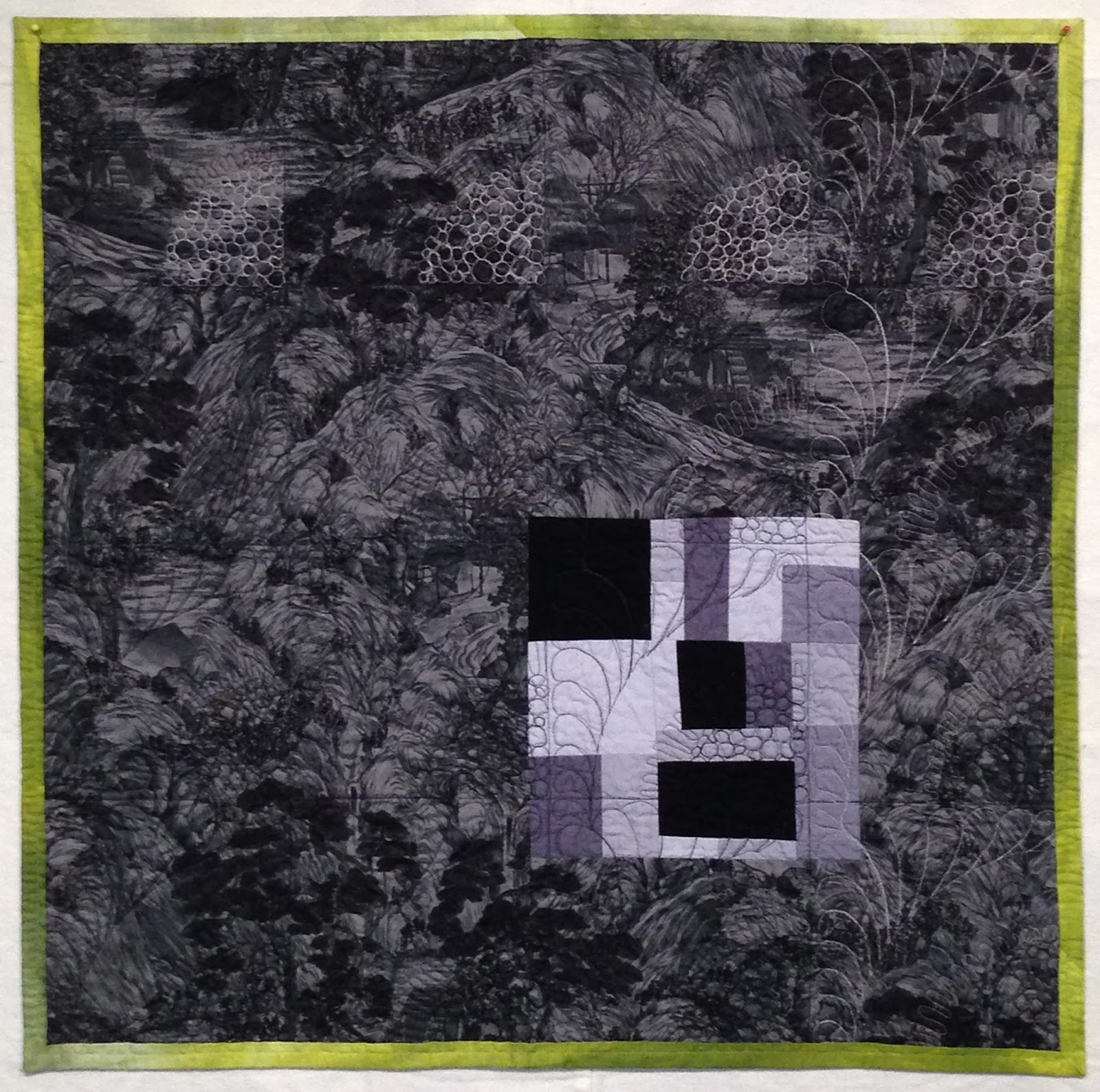
 |
| Value Does the Work (front) |
 |
| Value Does the Work (back) |
The final thing I need to do is embroider the shade numbers in the binding.
 |
| Roadmap showing which shade was used where. |
Susan
PS I completely missed it, but this quilt was featured as quilt of the day for June 16, 2015 on The Quilt Show.
PPS I'm delighted to report that this quilt was accepted into QuiltCon 2016.
Wow what a cool quilt! I usually prefer more colorful stuff but I really love what you've done here!
ReplyDeleteLove the values changes and the subtle differences in the arc width within each block. It adds visual interest.
ReplyDeletelove the design. Fun that you added the little splash of color to go with the more neutrals. Looks like alot of work but it definitely worth it. micki@2dogssstudio.us
ReplyDeleteGreat quilt and quilting design!
ReplyDelete