Wednesday, September 23, 2015

Featherweight's Big Bang

Here is my Wednesday WIP...

I was successful in signing up for the Modern Quilt Guild Michael Miller Fabric Challenge. I got my package in the late summer -- I will admit to being a bit disappointed at receiving several duplicates and thus not the full spectrum of fabrics. I had to go to the Fat Quarter Shop (great selection) to finish out the choices and get backgrounds, etc. My initial inspiration came from a recent MQG webinar by Christina Cameli on wedge quilts. Given the small amount of fabric, I did a little designing on EQ7 instead of going fully improve and used EQ7 to print the wedge freezer-paper foundations.
EQ7 mockup from which foundations were printed
Arranging pieced foundations for assembly

Back of the assembled circle of wedges, seams pressed open


Finally, I recently inherited (or rather have on long-term loan) a Singer Featherweight. This little cutey is in perfect shape -- decals intact, carrying case with all the accessories, recently serviced and everything in working order. I bought it a little Sew-Ezi table, a walking foot, and seam guide, a cool (temp-wise) LED light bulb, and several other toys to keep it happy and make it feel loved. My goal is to make the entire quilt -- piecing, quilting, binding -- with the Featherweight.


Sewing the completed circle into the which background.

So far, I've done as planned. Foundations were all pieced and then sewn together, and the trimmed circle was sewn into the background. I did use a freezer paper template, starch and glue stick method to turn under the background seam allowance temporarily glue it onto the circle and then stitch in the fold line (shown above), but that is my usual approach. The Featherweight is surprisingly good at this fiddly stuff. The feed-dogs are narrower than our modern 7mm or 9mm machines, and the narrow foot gets into small spaces. Visibility could be a little better -- it would be nice if I can figure out how to attach a Brite-Lite using one of the oil port holes.

The original design focused on the wedges and did not include a border. I went back, using a picture of the completed center overlaid in the center of the EQ7 worktable, to design a foundation pieced border.
Updated EQ7 design, using a photo of the center to design the border
Those are finished and sewn on. I made a back out of MM left-overs and now I am working on the quilting, first with the walking foot and then hopefully some free motion. Again, visibility is a bit of an issue, but my ditch-stitching is surprisingly good. I'm still thinking about how to do the free motion with the Featherweight, since the feed-dogs don't drop. Maybe with an adjustable height free motion foot and stitch length set to 0?

Thanks for stopping by...

Susan

Wednesday, August 19, 2015

Big Cats, Little Cats

I am participating in a book bee, reading and quilting our way through Carolyn Friedlander's Savor Each Stitch. Simultaneously, I saw a couple of Janeen van Niekerk's foundation pieced cat silhouette blocks on Pinterest and then found her patterns on EQ7 (http://electricquilt.com/online-shop/silhouette-cats/ ). I thought the cats would be fun, if a bit challenging to make, and was playing with arranging them in a custom set. The reclining cat 'accidently' set itself as a HUGE block behind the smaller ones. VOILA... Scale.
EQ7 Mock-up


Pre-cutting pieces for paper piecing.
Live cat helping piece the fabric cat

Little Cats pieced and testing out background

After making the little cats, I had to piece the big cat, with adjustments to the pattern to 'piece in' the little cats. I printed the pattern at Kinko's, full size, arranged the little cats, adjusted some of the lines, and then traced onto freezer paper to cut apart and make the piecing templates.

Kinko's printed Big Cat pattern with pieced Little Cats positioned


Freezer paper pattern ready to cut apart

Sections pieced and ready to join


Vinyl overlay to test out quilting choices
Quilting was done with various 100wt Silks to match the backgrounds. The gray background is quilted with a loose fill reminiscent of balls of string, unraveling string, a cat toy, and a mouse.
Helper cat ready to pounce in case the quilt tries to escape
Mouse quilted into the gray background.
Each cat has a different background fill, and spikey fur in a matching thread
Top quilted and waiting for binding (~40"x54")
After auditioning some binding choices (see above), I've decided to go with gray, matching the background, with an accent of navy blue perl cotton couched in the ditch. I love how this is turning out and have learned a lot about foundation piecing while Savoring Each Stitch. This is my work in progress, not just for the week, but pretty much for the summer. Hope you are making progress too.

Susan

(As always, thanks for stopping by. Comments welcomes.)

Addendum:

Final quilt, with binding and couched accent


Saturday, July 4, 2015

More DNA

Its Baylor College of Medicine Graduate Student's Art Show/Auction time again. Last year I didn't get anything done in time to enter, but in the past, small biology/DNA stuff has been popular. I've been playing with using hexies to represent DNA (see also Cardiac DNA) and thought I would try a few simple ones (Qube-Quilts) that represent the sequences that code (or could code) for tri-peptides (three amino acid mini-proteins) that have physiologic function.

Wikipedia lists a few examples of tri-peptides, including:
For no particular reason, I decided to start with GSH (glutathione), and IPP (isoleucine-proline-proline), with GHK and TRH as backups. The next thing was to get the DNA sequence that might code for these. Some amino acids have several possible codons so I used a DNA codon table to pick combinations that were 'pretty'. The real sequences might differ but realism only goes so far, and then art takes over.

I used EQ7 to lay out the colors and to try out different arrangements. I used complementary colors (green, purple) to represent the two DNA base pairs (i.e. purples for A:T vs greens for G:C), and light shades for the pyrimidines (T,C), and dark shades for the purines (A, G) or vice versa. Fabrics are Moda solids (I think I like the solids best), and small scale tone-on-tone prints.

GSHIPP
Hexies (3/4 inch on a side) were prepped using Sewline washable glue stick, instead of stitching or basting, to temporarily hold the fabric to the hexagon card stock. This was really fast and was not too difficult to remove. The secret is to use as little glue as possible. There are 18 hexagons in each little quilt and I have 4 quilts planned. It only took a couple of hours to prep them all.

The next thing was to stitch the hexagons together to form the sequence. I used Superior Kimono Silk. This is a very thin, strong, smooth thread. It was great to work with. The result is a freestanding piece that is positioned on a back ground fabric and appliqued in place with an invisible thread like Superior Monopoly using a very narrow zigzag. When the shape is firmly appliqued in place, then I snip the back and cut away the background behind the applique. This exposes and allows removal of the paper hexagons.
Back of another project showing cutting away behind the applique.
After layering up each piece (top is a pale hand dye from Frieda Anderson, backing is a purple polka dot from Marcia Derse), I used a flex-curve to layout sweeping curves to demarcate areas for different quilting motifs (marked with disappearing clover fine line), and I also marked the initials of the peptide name using a light box and a printout of huge letters in stencil font.

The sweeping curves (walking foot) and outer sections (free motion) were quilted with lime green aurifil on the top and a dark purple auriful in the bobbin. For the matchstick and stipple quilting, I switched to a pale purple Invisifil (Wonderfil) on the top and a light purple Bottomline (Superior) in the bobbin. I sometimes have problems with invisifil breaking or shredding, but this time is worked with no problems. Matchstick quilting was done free-hand, with only a couple of reference lines marked to keep things vertical. The fine match-sticks show the letters in relief, which I think looks pretty cool (see We <3 Pam for another example).

GSH -- Top IPP -- Top

Since these are going to be for sale in the art show, I wanted to be sure that buyers know what the quilt is about and to provide an easy way to hang the quilt. I used the corner triangle method and added label information to one of the triangles.
GSH -- Back IPP -- Back

I love how these turned out and hope someone else will love them too. The next ones will be blue/turquoise and orange/yellow, and I'm looking forward to starting on them. The units are prepped -- now they just have to be pieced together.


Unfortunately, they won't get done in time for this year's Art Show.

Thanks for stopping by ... (comments are much appreciated).

Susan

Since I've only finished two peptides and the others are in progress, I'm linking up with http://www.freshlypieced.com/2015/07/wip-wednesday-scrap-happy.html .

Sunday, May 24, 2015

Color gets the credit

I am part of a small group from the Houston Modern Quilt Guild that is reading Carolyn Friedlander's book, Savor Each Stitch: Studio Quilting with Mindful Design. We have completed the chapter on "line", are currently working on projects for the "contrast" (more about those in the future), and are looking forward to "color".

(Turns out I got a lot ahead of myself -- COLOR isn't next. We still have to do SCALE. Oh well. I just couldn't wait.)

I got a little ahead of myself, and got inspired by Rebecca Bryan's Rainbow Remix from her book "Modern Rainbow". One the self-imposed constraints for my projects for the book bee, is to use what I have on-hand and not buy additional fabric. Of course Anna V. says it OK to buy thread, but that is another story. In any event, I had a charm pack with 42 squares and 20 different colors from Grunge Basics by BasicGrey for Moda. Actually, I only had 40 squares and 19 colors because I used two squares in my "line" project. I love the mostly solid but slightly mottled effect on the fabric. It looks slightly weathered.
Charm squares matched up by color and ready for cutting
 Using Rebecca's quilt as the inspiration, I paired up the colors (lights and darks), wacked the 5 inch squares up into 1.5-2.5 inch strips,  sewed them back together, and then improvisationally pieced the chunks into bigger and bigger chunks. This was really a challenge to use everything -- all I have left is 3 or 4 1 inch pink squares, and a few unusable slivers from trimming. I really did not waste much because after accounting for seam allowances, 40 5 inch squares each cut into 3 strips and sewn back together gives you about 630 square inches of potential finished top and I produced a top that measures just about 620 square inches.
"Color gets the credit"
The whole top is only about 25x25, and one edge is wonky, but I rather like how it turned out. I looking forward to quilting but have no idea yet what that will look like.

Thanks to Rebecca for the inspiration and thanks to you for visiting -- comments and suggestions are very welcome.

Susan

Saturday, May 9, 2015

Value does the work

I am part of a small group from the Houston Modern Quilt Guild that is reading Carolyn Friedlander's book, Savor Each Stitch: Studio Quilting with Mindful Design.

We have completed the chapter on "line", and are currently working on projects for "contrast". The chapter is mostly about contrast in value. To play with that, I decided to "go gray" and really focus just on the effect of different values and eliminate the effect of color -- like yellow next to medium purple, which represents both contrasts in value and color -- although I could not resist throwing in one little spark of color.

Years ago I took a class with 
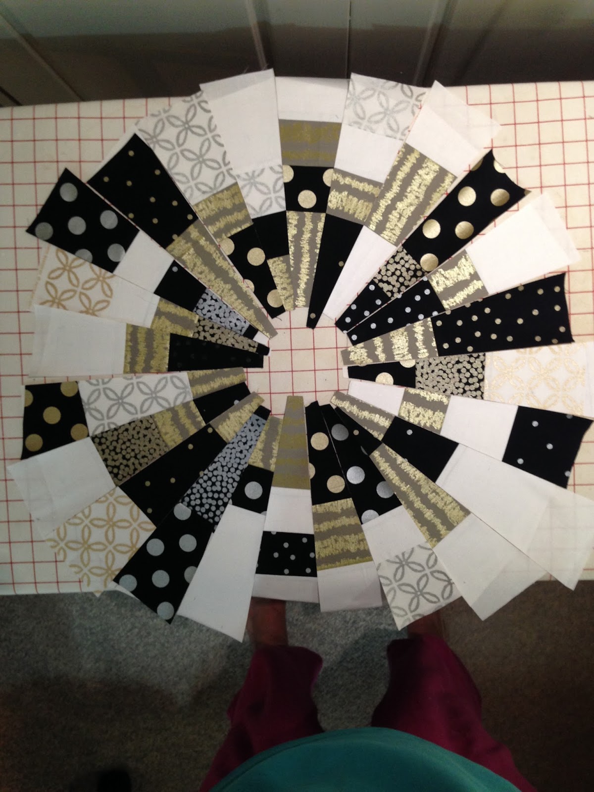
Caryl Bryer-Fallert (now Gentry) on appli-piecing, and I bought a bunch of fat eighth packets in her hand dyed gradations. Important for this, I still have (had) a 7 step gray gradation, to which I added white (actually, I thought it was what, but turned out to be a light woven fusible interfacing -- I fused two layers to each other and used it anyway), and black (probably Kona black).
Seven step gradation plus white and black and magenta
I used EQ7 to adapt a circular design in the book and to plan the coloration (valuation). I also carefully tested whether the planned size templates would fit my fat eighths, since there is no getting more of this fabric.

The values change in a grid of columns and rows (see completed quilt below). In each column, the background (A) and thin crescent (B) are the same value, and in each row uses a different pair of values, with the fat crescent (C) using one gray and the bottom quarter circle (D) using a different darker gray. The shades progress left to right and top to bottom, from light to dark. I cannot get over how different the same value looks depending on what it is next to.
Original EQ7 mock-up One version of the block (6"x6" finished)

There are 2 'isoforms' of the block, so I printed all the templates on freezer paper and then carefully labeled the colors and versions before cutting apart and ironing onto the fabrics. As you can see, I used nearly every bit. After cutting out each piece, both C seam allowances and the concave B allowance were clipped and then, using a washable glue-stick, turned under and glued to the paper side of the freezer paper. Using a lightbox, the pieces were aligned on the seam line and glued in place with more glue stick or a thin line of Roxanne Glue-Baste-It. This process results in a very flat, stable and perfectly aligned block that is ready for either hand (not me) or machine applique. I used a very narrow zigzag with a very thin (Invisifil) thread. Once the seams are stitched, the freezer paper comes out easily and all the glue rinses out.

Freezer paper templates marked & ironed in place Free cutting the pieces
Row 1, Column 2 and 3 blocks assembled and sewn together
Quilt top
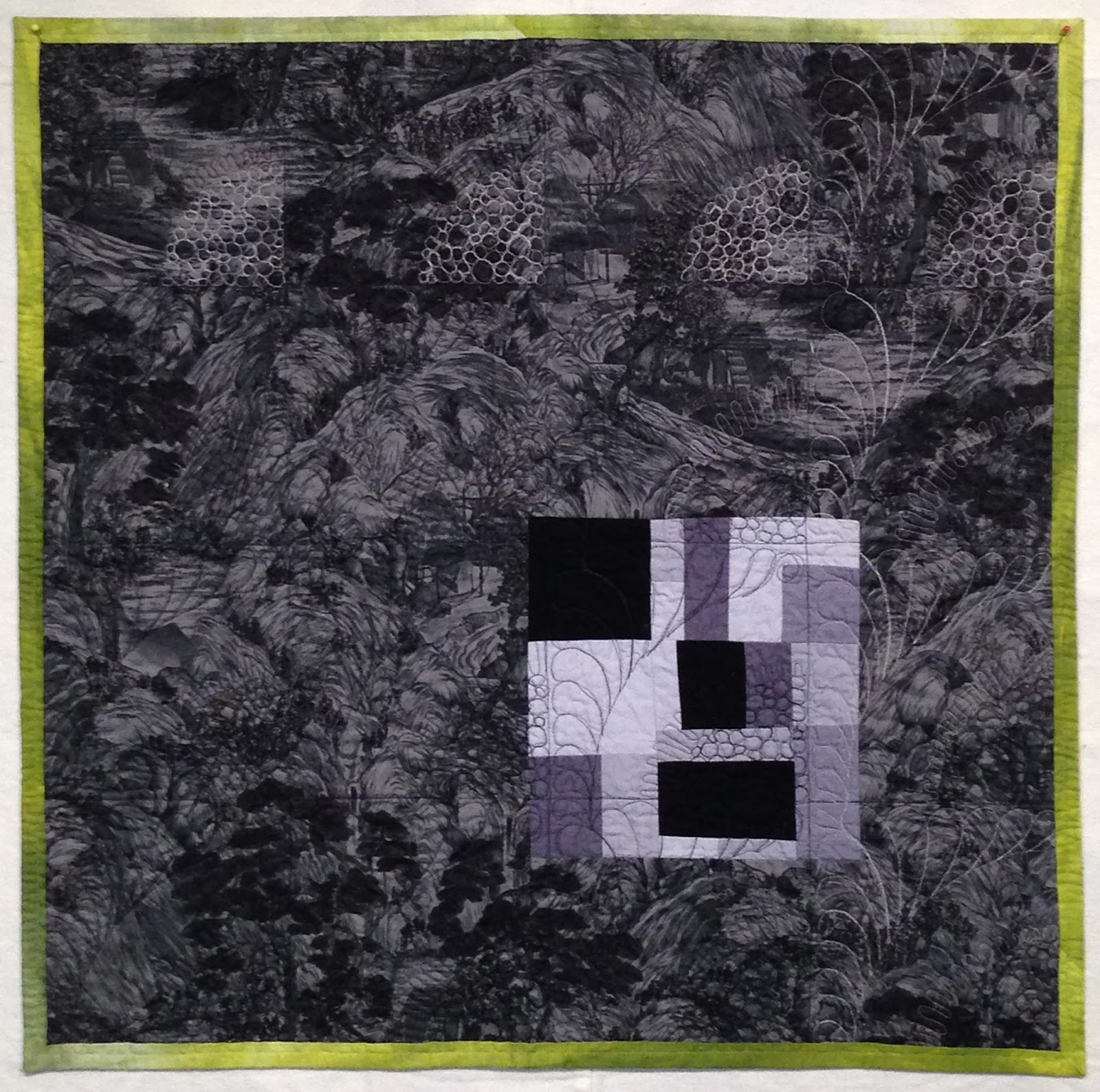
I've layered things up for quilting using a silk batting that I've been wanting to try, and a dark gray oriental print on the back that is left-over from a previous project. I decided to limit the contrast in thread color and focus on texture, so I bought (this is supposed to be 'use what you have', but Anna V in the book says "thread doesn't count" and that's good enough for me) 4 shades of gray Kimono silk and plan to match by row and column.
Silk threads Sketches to try out different quilting designs
Partially completed quilting
Things are really coming together although it has been hard to find time to work on this. AND, the jury is still out on binding -- binding or facing? if binding, what color? I'll cross that bridge when I come to it. I find that things often look different when they are sewn up or quilted, so I try not to decide more than I have to, until I have to (I think that is an old software design principle).

Hopefully, it will be done in time for the next book group meeting.

Until then I'm linking up with Lee at Freshly Pieced for Wednesday WIPs ...

Update: ....................................

I finished all the quilting and after considering the binding/facing options decided to go with this hand dyed green binding -- a fat quater I got from Frieda Anderson.

Close up of the upper corner.

Value Does the Work (front)

Value Does the Work (back)
 I used the remaining bits from the piecing to improvisationally piece a square for the back. The backing fabric is pieced down the center, along the left edge of the square. The pieced square was 'set-in' to the backing fabric (no pieced seams) on the right half. You can see that I used black or gray bobbin thread, depending on the thread and fabric color on the front.

The final thing I need to do is embroider the shade numbers in the binding.
Roadmap showing which shade was used where.
This was a wonderful experiment and I love how it turned out. It is also a nice allegory for how much we need the parts that don't get much credit. I plan to find a place of it in my office.

Susan


PS I completely missed it, but this quilt was featured as quilt of the day for June 16, 2015 on The Quilt Show.

PPS I'm delighted to report that this quilt was accepted into QuiltCon 2016.


Saturday, January 3, 2015

Tips for Mariners

I really like Mariner's Compasses. I took a class with Judy Mathieson a few years ago and learned her freezer paper method of paper-piecing. Using this method, you don't have to sew though the foundation; you can fold back on the sewing line and sew next to the fold. This lets you control which way the seam allowance goes. With 'stitch through the foundation' paper-piecing, the seam allowances always lay under the piece you just sewed on. This can make things very bulky on the long skinny points.

The example below was made using this method. Note the there is no stitching through the freezer paper sections. Tic-marks indicate where the seams should match to the next section (see upper right on the right-hand figure, where two section have been sewn together).
Very small Mariner's Compass Sections that make up the compass
The example below shows positioning the last piece of fabric under the folded back foundation, ready to sew. Note how the teal fabric clearly covers the entire subsection, with plenty of seam allowance all around. This is another BIG advantage of the fold back method.
Compass foundation section folded back and
ready to sew the last piece on.
Sewing next to the folded foundation
Even if you stitch through the foundation, folding back on the the planned stitching line makes it very easy to see that you have plenty of fabric to cover. NO nasty surprises.
Sometimes you have to use a bright light
behind the piece to see the shadow clearly.
Since the stitching does not go through the freezer paper, you can change the direction of the seam allowances. You can also clip into the seam allowance and iron part one way and part the other, depending on what works best.
Back of work: Clip seam to allow change in direction

Front of work: Seams were clipped to allow seams at tips of
points to be ironed away from the point.
The freezer paper can be ironed back on (many times), allowing final trimming and assembly.These bisected points are especially tricky (for me), and this method lets you make some minor adjustments after to make the points come together properly. For example the blue point in the bottom right got 'disneyed up' a bit before being sewn into the setting ring.
Assembled compass, ready for trimming.

It is a bit off topic, but this particular wall quilt also got a lot of free-form quilting. The design was sketched full size on tracing paper and then transferred to the top using the method described in Cardiac DNA. The quilting stops are the inner border and the compass points, making for a lot of ends to bury, but I think it was worth it.
Full size sketch of flowing sections for quilting.New Directions II: Finished compass (24 X 24 in)
with a lot of quilting http://doyoueq.com/quilt_gallery/new-directions-ii/.
Hope this is helpful.

Susan